Pantone color of the year 2016
For the first time, Pantone Institute picks two colors for the prestigious title.
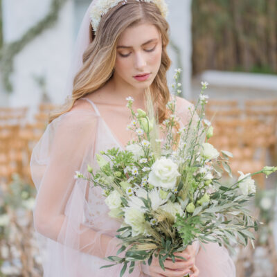
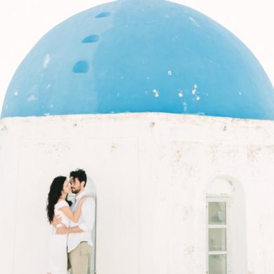
According to Pantone, 2016 is the year pastels are making a comeback, and we’re not complaining! For the first time in its history of color forecasting, Pantone’s Color of the Year for 2016 names not one, but two colors as next year’s big ones: Rose Quartz and Serenity.
The geniuses behind the color of the year turned to the biggest trend of 2015 — “mindfulness” — for 2016. “We wanted compassion, which today a lot of people are looking for,” Leatrice Eiseman, executive director of Pantone’s Color Institute, told the Wall Street Journal.
So what does that mean for all of you getting married in 2016?

As reported by Pantone Rose Quartz is a persuasive yet gentle tone that conveys compassion and a sense of composure. Serenity is weightless and airy, like the expanse of the blue sky above us, bringing feelings of respite and relaxation even in turbulent times.
The pairing of Rose Quartz and Serenity brings calm and relaxation. Appealing in all finishes, matte, metallic and glossy, the engaging combo joins easily with other mid-tones including greens and purples, rich browns, and all shades of yellow and pink. Add in silver or hot brights for more splash and sparkle.
Leatrice Eiseman, the executive director of the Pantone Color Institute, said the joining of the two colors reflected “a soothing sense of order and peace” — presumably an attractive thing to incorporate into a product at a time of insecurity and global turbulence. It also implies that there is no line between “us” and “them.”
Which one is your favorite?